User Experience: Simple Tips to Make Your Site Feel Fresh
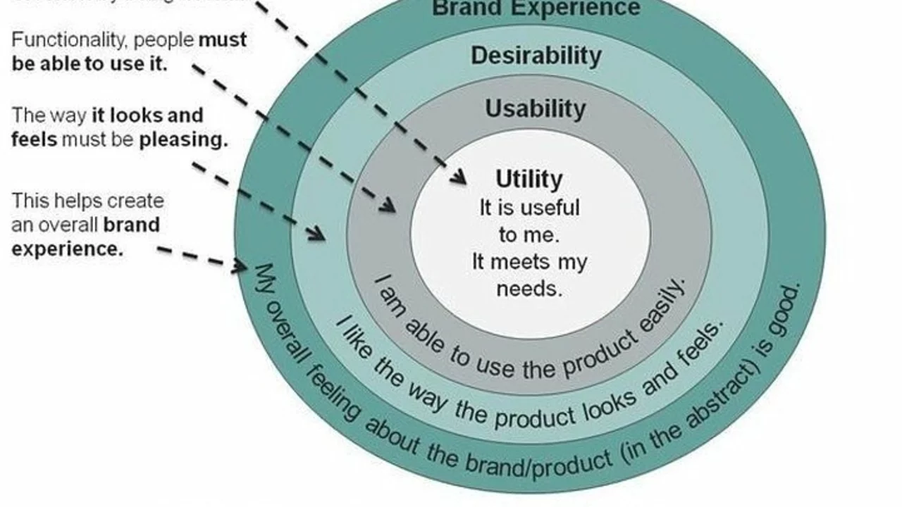
Ever landed on a website and felt lost? That’s a sign of poor user experience (UX). Good UX means visitors find what they need fast, feel comfortable, and want to come back. It’s not magic – just a few habits you can add to any project.
First, keep navigation clear. Labels like "Home," "About," and "Contact" work for most sites. If you have many sections, group them under headings like "Products" or "Resources". Test the menu on a phone and a desktop. If a link is hard to tap on a small screen, shrink it down.
Speed Up Loading Times
People leave a page that loads slowly. Compress images, use modern file formats, and enable browser caching. A page that opens in under three seconds feels snappy, while a slower one feels frustrating. You don’t need a developer’s degree to check speed – free tools like PageSpeed Insights give you a score and clear steps.
Next, write copy that matches the visitor’s mindset. Use everyday words instead of industry jargon. If you sell coffee, say "Buy a cup of fresh coffee" instead of "Acquire a freshly brewed caffeinated beverage." Simple language makes decisions easier and reduces bounce rates.
Test, Learn, and Improve
Don’t guess what works – watch real users. Set up a quick usability test with friends or a small group. Ask them to complete a task, like finding a contact form. Note where they hesitate. Those pain points become your checklist for fixes.
Heatmaps are another handy tool. They show where users click most and where they ignore. If a button is rarely clicked, move it higher or make it stand out with a bolder color. Small visual tweaks often bring big gains.
Accessibility matters, too. Use contrast ratios that are easy on the eyes and add alt text to images. Screen reader users rely on those details to understand your site. A site that works for everyone also scores better in search engines.
Finally, keep an eye on analytics. Look at metrics like average session duration and pages per session. If they drop after a redesign, you probably introduced a new barrier. Roll back or adjust until the numbers improve.
In short, good user experience is about clarity, speed, plain language, and constant testing. Apply these habits step by step, and you’ll notice less frustration, more clicks, and happier visitors. Start with one change today – maybe compress that big hero image – and watch the difference unfold.
