Website Review: The Real Issues Behind the Times of India Site
If you’ve ever tried to read an article on the Times of India, you might have felt a rush of frustration. The site is packed with ads that load slowly and push the actual content far down the page. It’s not just annoying – it actually slows down the whole browsing experience.
Beyond the ads, the layout feels chaotic. Menus crowd each other, sidebars compete for space, and it’s hard to tell where the main story begins. When you can’t find what you’re looking for quickly, you end up clicking around aimlessly, which only adds to the irritation.
Then there’s the content itself. Many readers say the articles lack depth and often repeat the same points. When you’re looking for reliable information, shallow coverage leaves you questioning the site’s credibility.
Too Many Ads, Too Little Speed
Ads are a major revenue source, but when they dominate a page they become a problem. Pop‑ups, banner ads, and auto‑play videos all demand bandwidth. On a slower connection, the page might load for over ten seconds, and that’s enough time for a reader to abandon the article.
Even on fast connections, the visual clutter creates mental fatigue. You have to scroll past dozens of promos before you see the headline you wanted. This forces you to skim, which defeats the purpose of reading an in‑depth news piece.
Design That Gets in the Way
The Times of India’s design was built for a desktop‑first world, yet a lot of users now check the site on phones and tablets. The responsive layout often squishes text, making it hard to tap links without hitting an ad. Navigation menus are placed close together, so you can easily tap the wrong button.
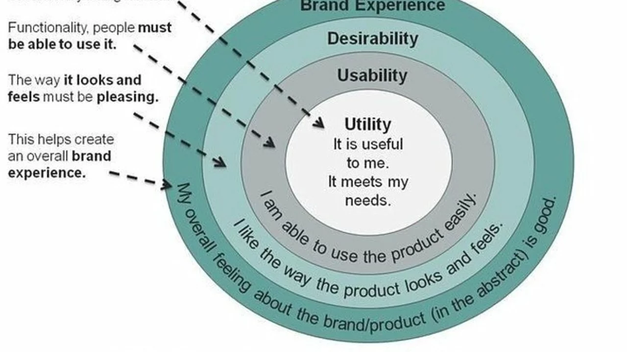
Clear headings and simple navigation are essential for a good user experience. When a site mixes too many colors, fonts, and sections, the eye can’t settle on anything. That’s why many visitors end up leaving the site for cleaner alternatives.
So, what can be done? First, limit the number of ads per page. A few well‑placed, relevant ads are less intrusive than a flood of unrelated banners. Second, streamline the layout: keep the main article front and center, tuck menus into a collapsible sidebar, and use whitespace to separate sections.
Finally, improve the quality of the writing. Readers want facts, context, and a clear takeaway. Investing in research and editing can turn a brief news blurb into a compelling story that keeps people coming back.In short, the Times of India site suffers from three main problems: ad overload, a cluttered design, and thin content. Each issue feeds into the next, creating a cycle that pushes readers away. By cutting down on ads, simplifying the layout, and delivering richer articles, the site could regain the trust and attention of its audience.
Are you a regular reader? Have you tried any workarounds, like using an ad blocker or a mobile app? Share your thoughts – the more we talk about these problems, the more likely the site will listen and improve.
